Data Analysis and Visualization with Power BI
In a visualization project at Ontario Tech University, I utilized Power BI to create a narrative about the housing affordability crisis. My work involved incorporating visualizations, DAX code, and Python programming to achieve the final outcome. I have attached my work in the link provided.
The housing affordability crisis: The housing affordability crisis is a growing global concern, affecting millions of people, particularly in urban areas. Rising home prices, stagnant wages, and a limited supply of affordable housing are pushing many individuals and families into financial hardship, making it increasingly difficult for them to find adequate shelter. In this document, I will try to identify the possible reasons and impact of the housing crisis in a city. The city has observed a sudden influx of people from outside; thus, the property’s rent and market value suddenly increased. To understand the severity of the problem, I have collected data and selected possible variables such as income level, monthly rent, housing cost, etc.
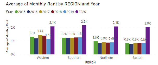
Changes in average house rent in the year 2019-2020 in total and region-wise.
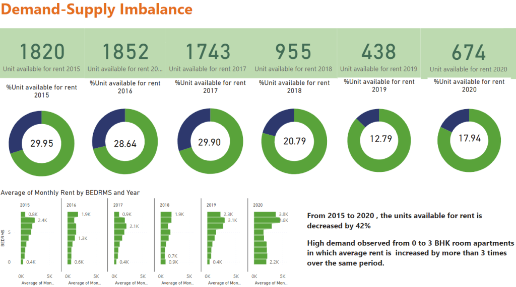
In this diagram we can see how the demand and supply are changed over time.
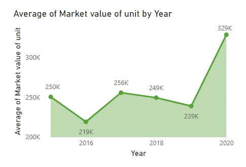
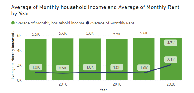
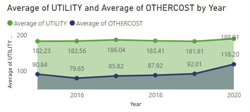
The average property value has been steadily increased in 2020, and the average utility cost has also increased.
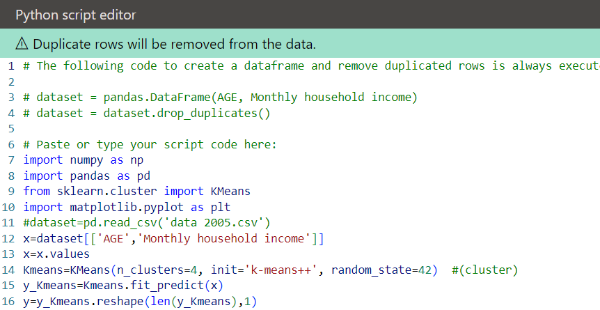
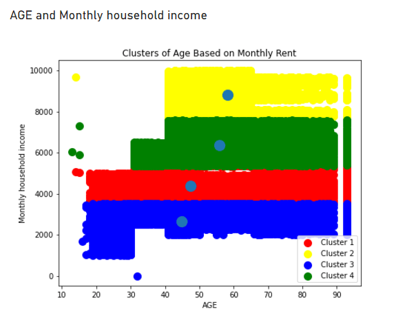
I have used the clustering method to find the age vs monthly rent. I used Python code in Power BI to get this diagram. A sample code is uploaded below.